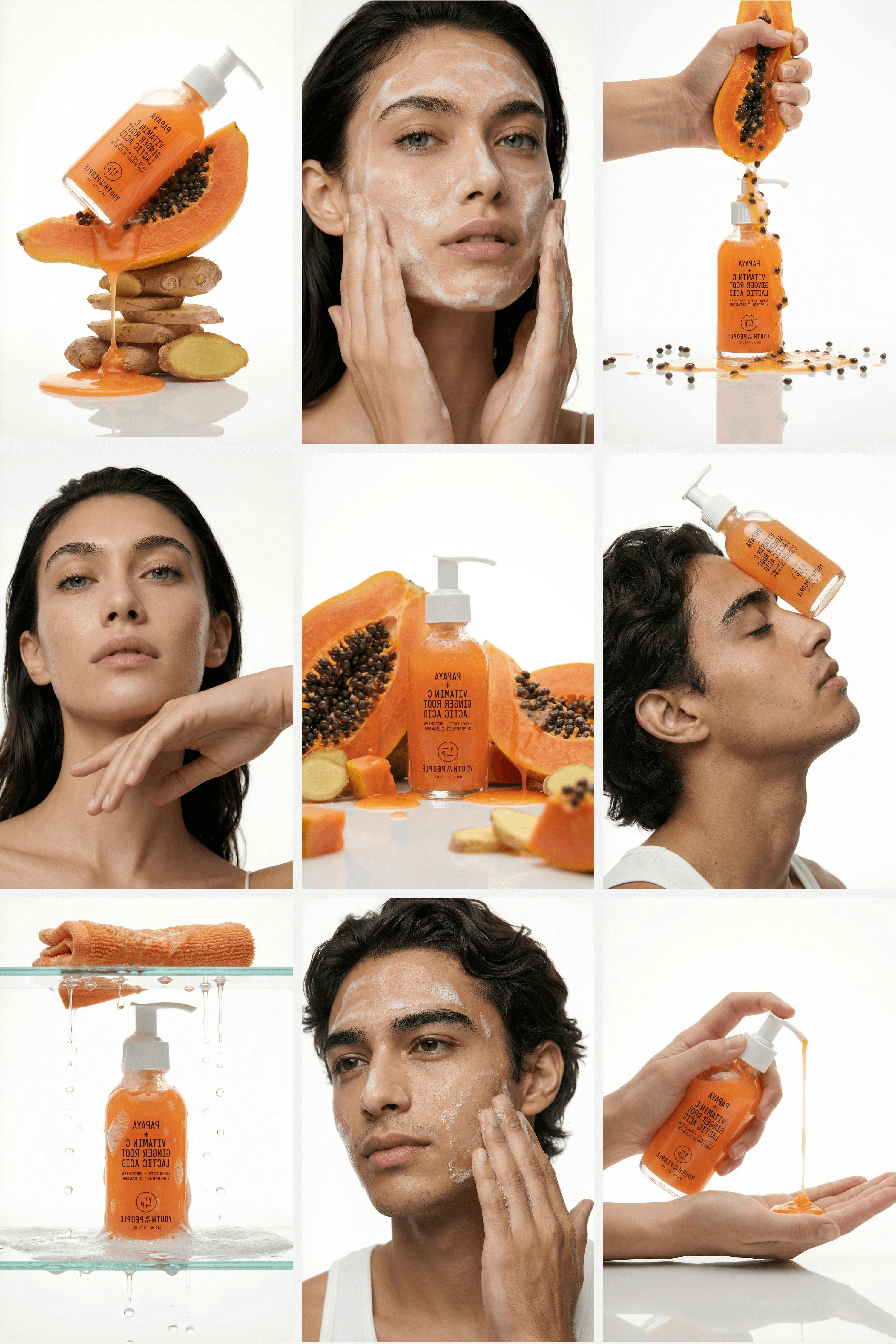
Skincare.
Grove
Editorial static visuals
Short-form videos
Micro video clip


PROJECT OVERVIEW.
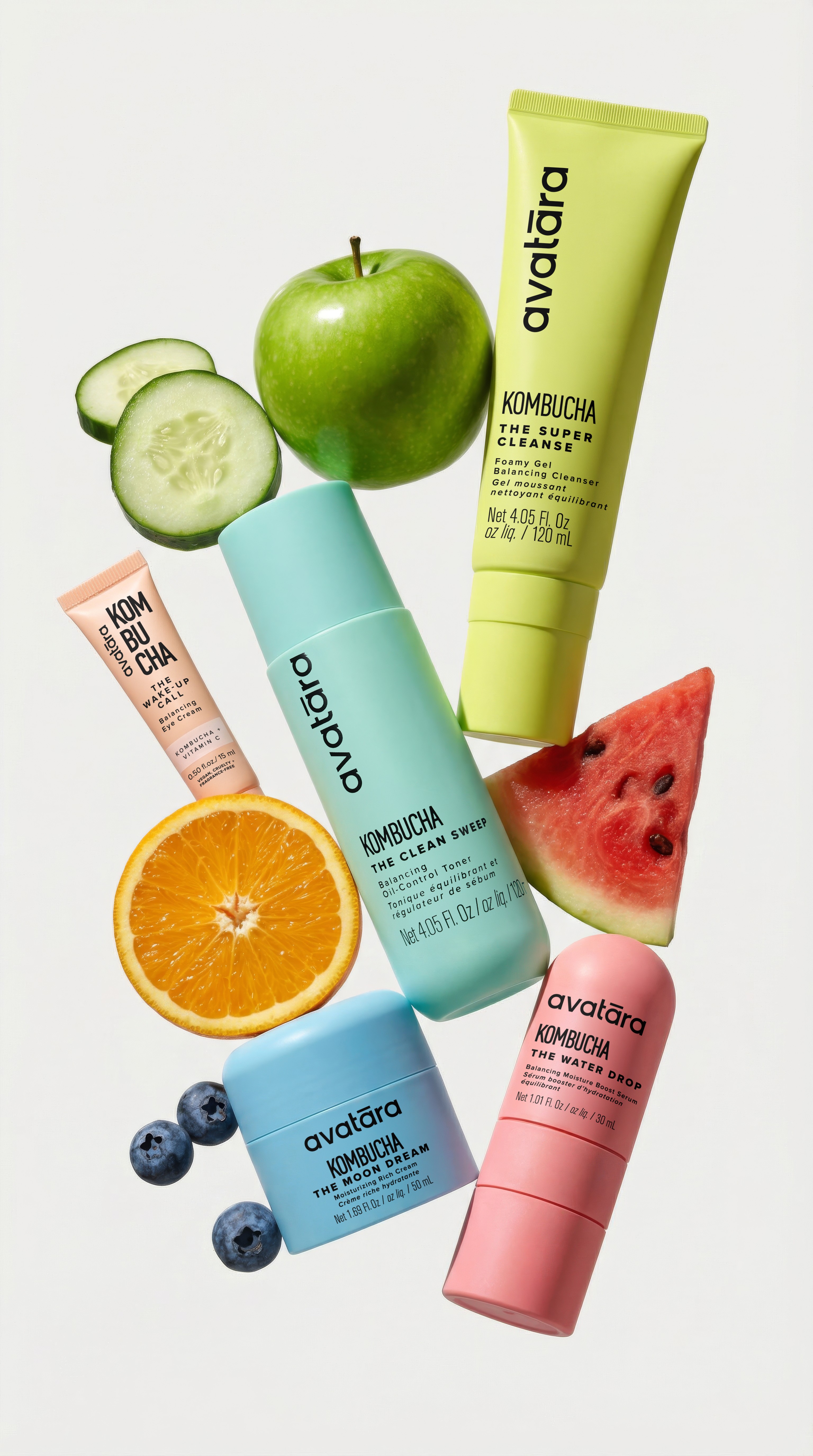
Grove began with a constraint. Every ingredient in the range had to grow within the same landscape, the Mediterranean interior. Olive, lavender, rosemary, eucalyptus, fig. From that constraint, everything else followed: the bottle shape, the colour of the clay, the choice of surfaces, the props in frame.
The aesthetic direction was warm, restrained, and botanical. Studio references were Aesop and Grown Alchemist, brands that let the product speak without decoration. Every visual was built around the same rule: nothing appears in frame without an ingredient to justify it. The fig is in the formula. The eucalyptus leaf is in the formula. The honey bee is there because beeswax is in the balm.
The goal was to demonstrate what a skincare brand's visual identity looks like when the formula defines the creative direction rather than the other way around.
Interested in something similar?


Next →
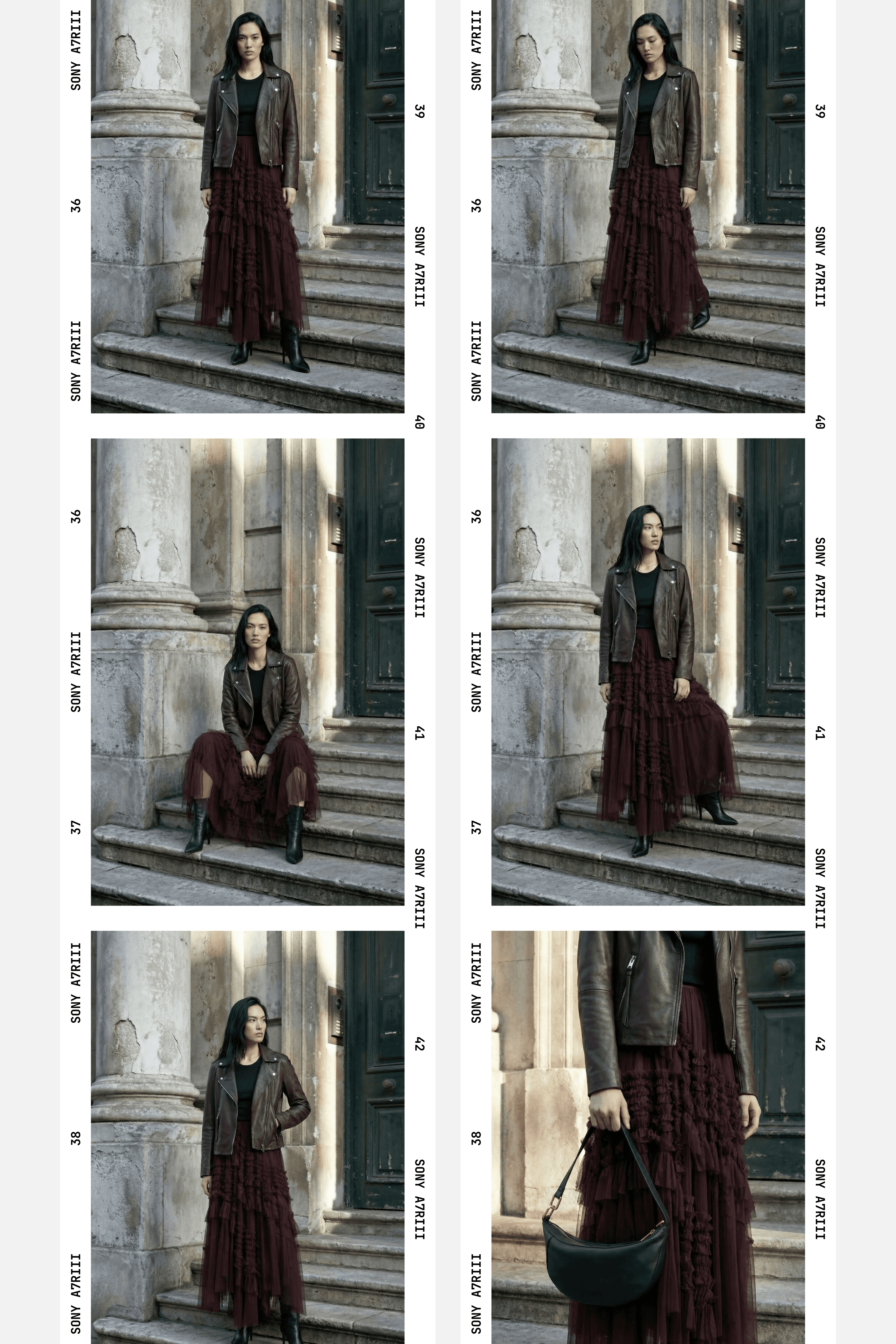
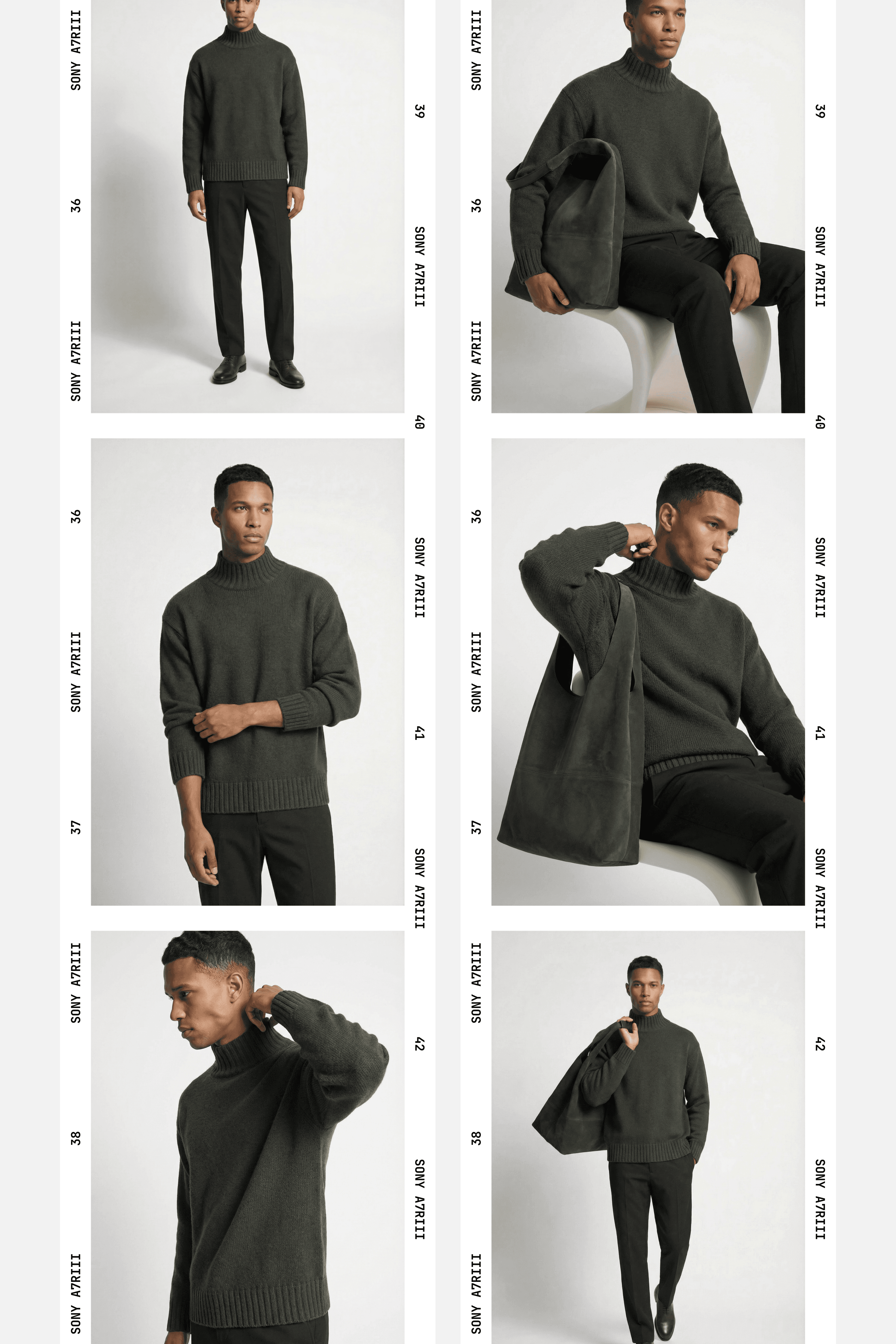
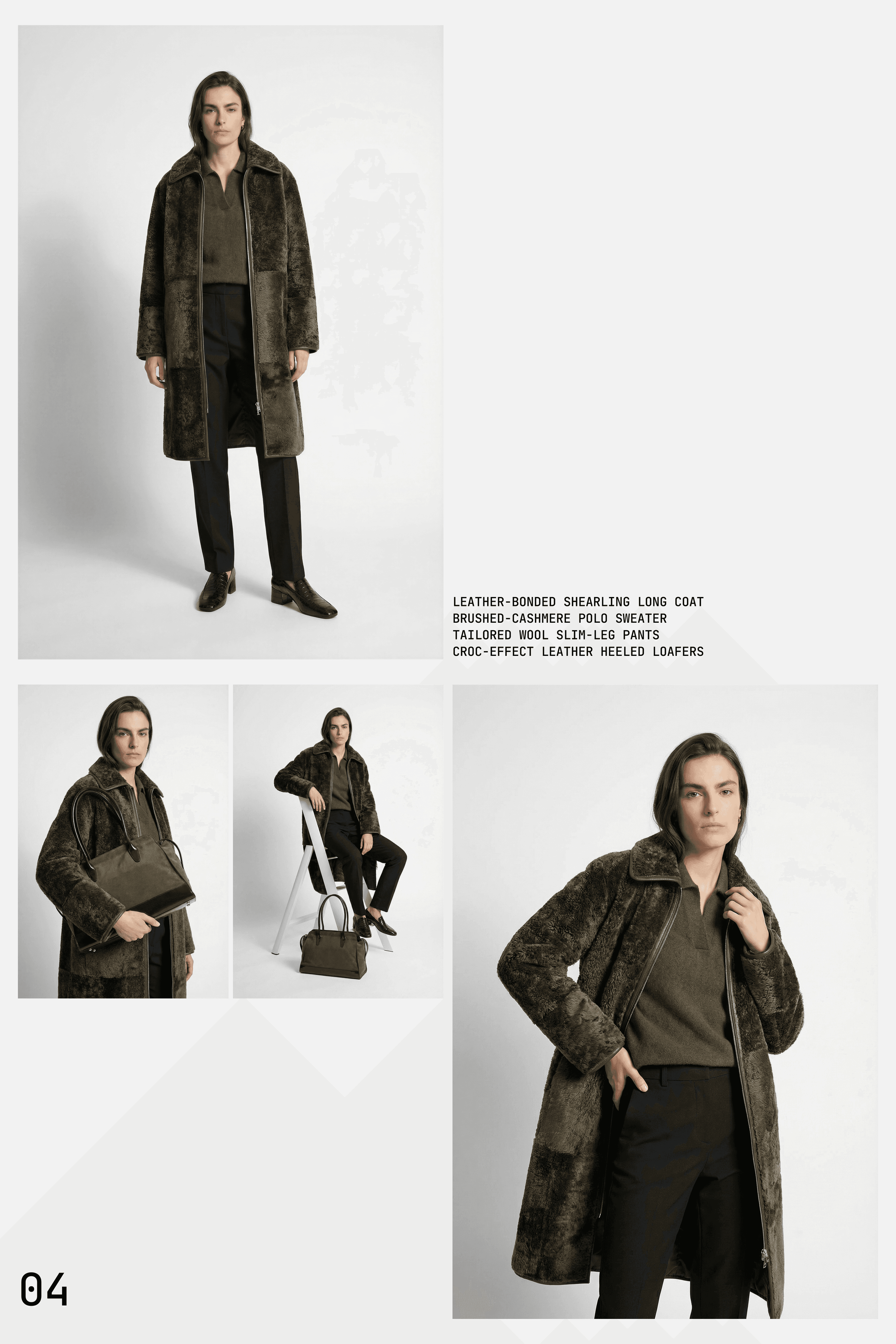
Consistency & detail
Consistency is treated as a core design constraint, not an afterthought.
From facial structure to fabric texture and lighting behavior, every frame is built to belong to the same visual system.
This allows the visuals to move confidently between full looks and close-up details without breaking cohesion.
FULL GALLERY.


" height="13.395770683651804px" id="OLJJyqF8D" transform="translate(0 0.5)" width="13.39539333151964px"/><path d="M 9.865 9.865 C 9.725 10.006 9.534 10.086 9.335 10.085 C 8.925 10.085 8.585 9.745 8.585 9.335 L 8.585 1.5 L 0.75 1.5 C 0.34 1.5 0 1.16 0 0.75 C 0 0.34 0.34 0 0.75 0 L 9.334 0 C 9.744 0 10.084 0.34 10.084 0.75 L 10.084 9.335 C 10.085 9.534 10.005 9.725 9.864 9.865 Z" fill="rgb(0, 0, 0)" height="10.085004783451154px" id="IB5GcMOgX" transform="translate(3.5 0)" width="10.084004783451158px"/></svg>)